Stop & Stare: Tips for Creating Engaging, Share-Worthy Content
By: Bethany Chadwick Cordero
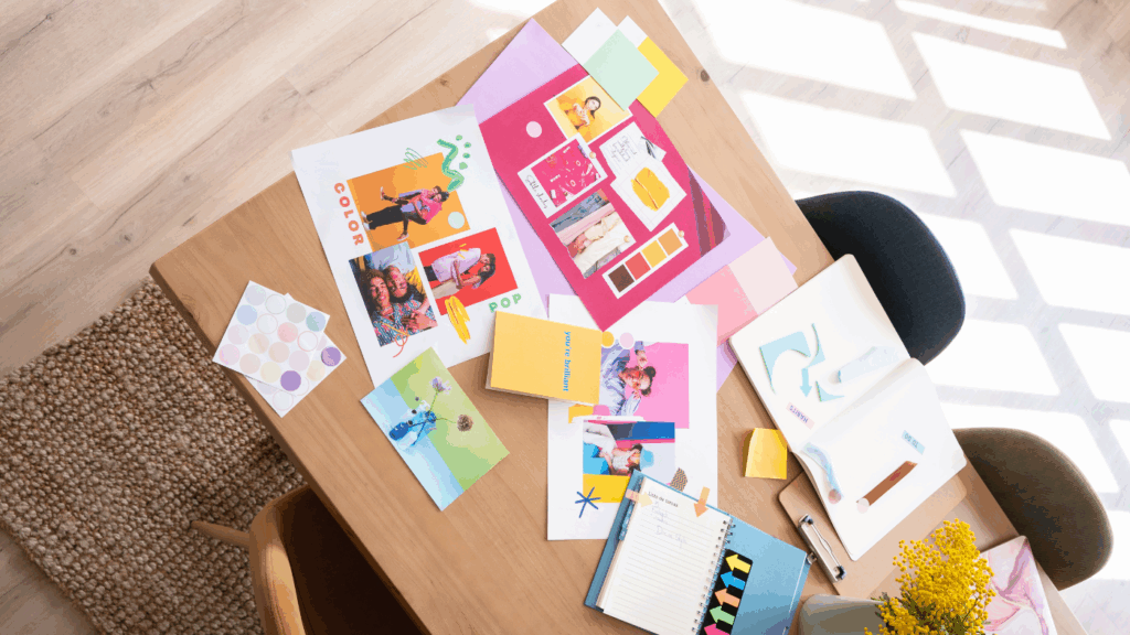
Let’s be real: in a feed flooded with endless posts, your content has milliseconds—literally—to make someone stop, stare, and share. At Pushing the Envelope, we see this every day. As a graphic designer, I know firsthand how the right design choices and the right tools can transform good content into scroll-stopping content that people actually want to save, send to a friend, or come back to later.
So, how do you do it? How do you create platform-specific visuals that don’t just look pretty but spark real engagement? Let’s break it down by format, tool, and mindset—so your next post isn’t just another blur on someone’s timeline.
Instagram Carousels: Tell a Story, Not Just a Slide Show
Carousels are one of Instagram’s best tools for engagement. Done right, they’re mini-stories your audience can swipe through, learn from, and share. Done wrong, they become a confusing jumble or a design that’s easy to scroll past.
Here’s what works (and what doesn’t):
DO:
- Hook them with your first slide. Think big type, bold color contrast, or a question that feels too good to skip. Example: “Are you making this mistake on your website?”
- Design every slide as a standalone piece. Treat each slide like a mini poster: clear headline, strong focal point, and enough negative space to breathe.
- End with a clear CTA. Encourage saves, shares, comments, or clicks. Even a small nudge like “Swipe back to save!” can make a difference.
DON’T:
- Overstuff a single slide. If you have five ideas, use five slides—not one. It keeps your message digestible and visually clean.
- Ignore brand consistency. Use your color palette, fonts, and logo placement consistently. It helps your audience recognize your content instantly.
- Turn slides into novels. Aim for roughly 15–20 words per slide. Let visuals do the heavy lifting.
LinkedIn Banners: Professional & Eye-Catching
LinkedIn is different. It’s more formal, but that doesn’t mean boring. Banners (whether on your profile, posts, or company page) should reflect professionalism and creativity.
DO:
- Use clean, legible fonts. Sans serifs like Helvetica, Proxima Nova, or Montserrat often look sharp across devices.
- Subtle brand colors. Strong color can work, but keep it balanced so your message stands out.
- Thoughtful logo placement. Make sure your logo supports—not dominates—the headline.
DON’T:
- Overload with text. Remember, LinkedIn banners are often viewed on mobile; too much text becomes tiny and unreadable.
- Chase every trend. Comic Sans or glitch effects might get attention, but not the kind you want.
- Ignore safe zones. On LinkedIn, your profile photo or buttons might block key parts of your design. Always preview before publishing.
Extra tip: Include a subtle call to action on your banner, like “Connect to learn more” or your website URL in small, legible text.
Infographics & Data Visuals: Simplify to Amplify
Infographics are everywhere because they work—when they’re simple and clear. But data overload is real. The goal: help people see the insight faster than they could read it.
DO:
- Highlight a single insight per graphic. For example: “76% of people prefer video content over static posts.”
- Use icons, charts, and whitespace to guide the eye. Visual hierarchy helps people process information quickly.
- Limit colors. A palette of 2–3 colors keeps your design focused and easier to understand.
DON’T:
- Dump in every stat you have. One strong number often makes a bigger impact than five smaller ones.
- Use overly complex diagrams. If you need to explain your graphic, it might be too complicated.
- Skip branding. Even a small logo or your brand handle helps people trace the content back to you.
Tools We Actually Use (Daily!)
Great design doesn’t always mean starting from scratch or opening Illustrator every time. Here are tools we genuinely use to save time and keep quality high:
- Canva / Adobe Express: Perfect for quick social posts, carousels, and branded templates. Easy to collaborate with teammates.
- Adobe Illustrator & Photoshop: Ideal for detailed graphics, logo work, and high-resolution design needs.
- CapCut: Want to turn static designs into reels or simple animations? CapCut makes it quick and mobile-friendly.
- Unsplash / Pexels: Free, high-quality photos to fill background spaces without blowing your budget.
- Google Fonts / Adobe Fonts: Keep typography fresh but consistent with your brand.
Pro tip: Save your brand colors, logos, and fonts in these tools so every team member stays on-brand.
Quick Checklist Before You Post
Even the best design needs a final pass. Before you hit publish, ask yourself:
- Is the headline clear and visible on mobile?
- Are key elements inside safe zones?
- Does it match your brand’s style guide?
- Does it include a call to action (save, share, click, comment)?
- Does it feel like your brand’s voice, not just generic advice?
This quick check can catch small mistakes that save you big headaches later.
Why Visual Storytelling Works
People remember 65% of what they see—even after three days—compared to about 10% of what they hear. That’s huge.
That’s why it pays to:
- Use metaphors or visuals that people instantly relate to.
- Repeat your brand’s signature style: same fonts, same color palette, similar layouts.
- Focus on emotional impact: Does it inspire? Teach? Entertain?
Example:
Instead of “Why you need SEO,” your carousel could lead with:
“Imagine spending hours on content nobody ever sees.”
That emotional hook keeps people swiping.
Beyond Engagement: Design for Action
Likes are nice, and shares are better, but the best content drives real action: newsletter signups, website visits, or product purchases.
Design with that end goal in mind:
- Use directional cues: arrows, swipes, and “keep scrolling” text.
- End carousels or videos with a clear next step (“Book your free consult” or “Download our guide”).
- For longer content (like whitepapers), use teaser graphics to highlight one insight and link to the full piece.
Extra Ideas to Level Up Your Content
Still looking for inspiration? Try these:
- Before & after posts: Show a design refresh or brand evolution.
- Mini case studies: Turn client wins into short carousels.
- FAQ graphics: Answer common questions visually.
- Quote cards: Use real words from your team or customers.
- Animated stats: Simple movement catches attention without needing a full video.
Staying Creative Without Burning Out
Even designers get stuck. When you do:
- Save posts that inspire you (Instagram’s Collections is excellent for this).
- Look outside your industry—architecture, packaging, and magazine design spark fresh ideas.
- Refresh your templates so your feed evolves with your brand.
Remember: design trends change fast. What matters most is consistency and clarity, not chasing every new filter.
Final Thought
Design isn’t just decoration—it’s communication. The best, share-worthy content makes people stop scrolling and feel something worth passing along.
Next time you’re designing that Instagram carousel, LinkedIn banner, or infographic, remember:
- Clarity makes it understandable.
- Creativity makes it memorable.
- Consistency makes it yours.
Put them together, and you’ve got content that doesn’t just fill your feed—it makes people stop and say, “Wow, I need to share this.”
Let’s Stop the Scroll Together
If you’re ready to level up your marketing strategy, let’s talk. At Pushing the Envelope, we’d love to help you build a smarter, more integrated approach to content and creative—one that doesn’t just look great but drives real results.
Contact us today, and let’s make something scroll-stopping together.
You May Like
What I've Learned So Far In My PTE Internship
By: Natalie Bollt It is safe to say that I have learned more in these past weeks interning at Pushing the Envelope than I could have ever imagined. While the courses I take at the University of Miami are educational and provide textbook information on the industry, this internship has
PTE Welcomes Our First International Intern, Wytske!
Written By: Wytske Rijpkema Hi Everyone, My name is Wytske Rijpkema and I’m thrilled to be the new and first international intern at Pushing the Envelope. I was born in a small village in the north of the Netherlands, where I grew up on a farm with my father (who
What I’ve Learned So Far In My PTE Internship
I can’t believe that I have been at this internship for more than a month now. Not having any experience at a PR firm, I wasn’t sure what I was getting into when I started. I was pretty nervous on my first day and didn’t really know what to expect